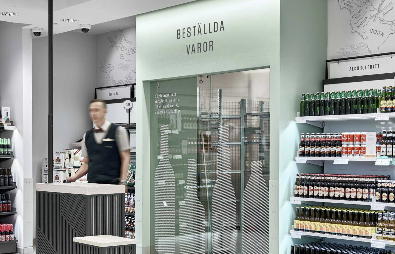
Systembolaget pick-up point
My work with Systembolagets pick-up point was well appreciated by Systembolagets Unit Managers, Designers and Operation Developers.
It was forwarded to development and is now being implemented. It will be available for all customers at Systembolaget at the end of this year.
It was forwarded to development and is now being implemented. It will be available for all customers at Systembolaget at the end of this year.
01. Background
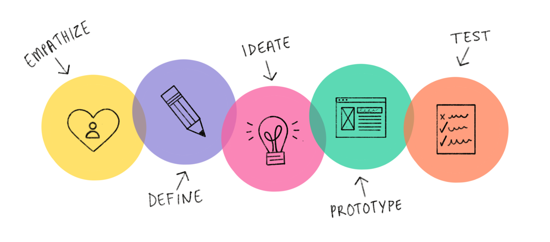
During my internship at Systembolaget i was assigned with multiple projects. My biggest area of responsibility was to apply Design Thinking of Systembolagets pick-up point and its digital terminal solution. I was working with the complete userflow from the first customer interaction with the pick-up text message, to QR-Code and terminal interaction.
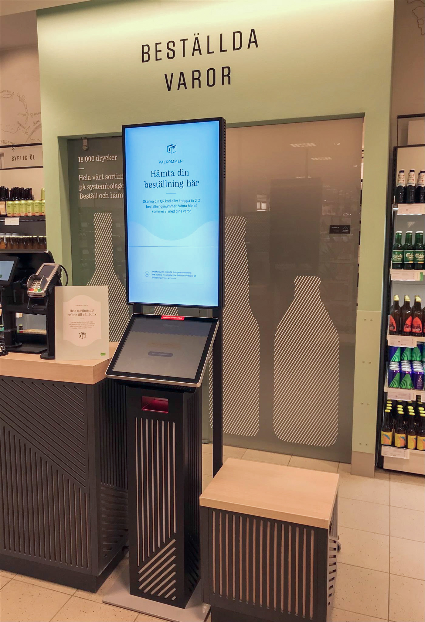
The terminal is a touchscreen tool located in selected Systembolaget shops used to simplify the customer journey for picking up orders done at www.systembolaget.se. I have been working with the entire Design Thinking process, from prototyping in figma, to usability testing, presentation of insights and design improvements. I came up with a good variety of improvements that was well appreciated by our Stakeholder, Unit Managers and Operation Developers.
The terminal is a touchscreen tool located in selected Systembolaget shops used to simplify the customer journey for picking up orders done at www.systembolaget.se. I have been working with the entire Design Thinking process, from prototyping in figma, to usability testing, presentation of insights and design improvements. I came up with a good variety of improvements that was well appreciated by our Stakeholder, Unit Managers and Operation Developers.
02. My task
Apply Design Thinking process of the terminals current userflow.
‣ Explore the current userflow of the terminal.
‣ Re-create current userflow in figma as preperation for usability testing.
‣ Prepare and conduct usability testing.
‣ Presentate insights.
‣ Facilitate workshops, turn feedback into design solutions.
‣ Explore the current userflow of the terminal.
‣ Re-create current userflow in figma as preperation for usability testing.
‣ Prepare and conduct usability testing.
‣ Presentate insights.
‣ Facilitate workshops, turn feedback into design solutions.
‣ Validate new design solutions
‣ Presentate design solutions and forward to developers.
‣ Presentate design solutions and forward to developers.
03. Understand my task
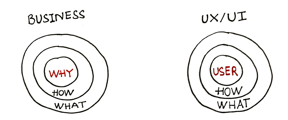
Before diving into the project i had to get a complete understanding of the terminal and its purpose. Why is Systembolaget striving to use this digital solution, and how is this solution better than a face-to-face experience. I arranged a meeting with the Operation Developers for this project and found out the following "why's" of the terminal.
‣ Clarify where the customer should go in stores while picking up ordered goods. The terminal should be a central pick-up point. The customer should easily identify the terminal both analog in stores or digital.
‣ Customers should not feel the need to 'grab' or interrupt staff while picking up ordered goods.
‣ Save time.
‣ Facilitate the work and logistics for the staff. The stores that do not use the terminal require that the staff need to think about several numbers and orders. The terminal's digital solutions will simplify this.
Knowing the terminal "why" i was able to continue my work.
04. Research
Before i started to conduct usability testing i created two scenarios for my testers. The two scenarios was not created to understand if users could complete the current flow, since this we aldready knew. But to understand and empathize potentional pain points with the current userflow. The two scenarios are as follows:
‣ Pick up a order using the order number sent by SMS.
‣ Pick up three orders using the order numbers sent by SMS, and then cancel one order.
I strived to imitate the real customer journey as much as possible. Therefore, while testing the terminal, i sent a text message with the same copy as the current. And matched the order numbers with our prototype.
I conducted in total 7 interviews. Testing the overall experience from the terminal copy, design and usability. To QR-Code and text message for picking up a order.
"Usabilitytests with five users captures approximately 85% of any usability issues that may need to be addressed." - nn group
After i conducted the usability tests. I compiled all the data and facilitaded workshops together with the team. We came up with a totalt of 25 insights that would improve the complete user journey. Copy, design and functionality.
05. Insights, quotes and painpoints from usability testing
Below, example of some insights, quotes and painpoints discovered during the usability test.
Insights
‣ More uniform instructions for the QR function. (Sign / copy / design - digital and physical).
‣ Help customers understand where the terminal is physically located in the store.
‣ Clearer connection between order number and waiting number (Design and copy).
‣ Calmer and clearer information hierarchies (Is everything needed? What is most important?)
‣ Improve the header's design, location and purpose.
‣ Improve the design and function of the way to delete an already placed order.
“If I go to the terminal and this is up, it feels like someone has already been here and started something. When the welcome screen looks like this. ”
“Can be complicated if you have more order numbers. What are the waiting numbers then? “
Pain Points
‣ Some people miss the connection between the waiting number and the order number.
‣ Several testers also reacted to the fact that the text message is cluttered without spaces.
‣ Some feel uncertain about what the "customer terminal" actually is, what it looks like and where it is located.
‣ There was some irritation among some testers that this was the first view when the customer has pressed 'done'. (home screen). Experienced messy.
‣ Confusion about the header, its purpose and location.
06. Previous design, wireframes and high-fidelity mockups.
Previous vs new text message after my reserach.
‣ Copy changed
‣ Message addresses earlier where the order needs to be picked up.
‣ Message includes more 'whitespace' making it easier and more pleasent to read.
‣ Message addresses earlier where the order needs to be picked up.
‣ Message includes more 'whitespace' making it easier and more pleasent to read.

Old copy
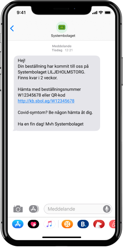
New copy
Previous vs new QR-code frame after my reserach
‣ New design have a more 'Systembolaget look' and is therefore, more trustworthy.
‣ New design is more identical to the whole terminal flow and user experience.
‣ New design is more identical to the whole terminal flow and user experience.
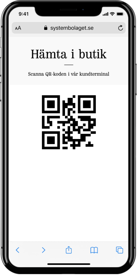
Old QR Code
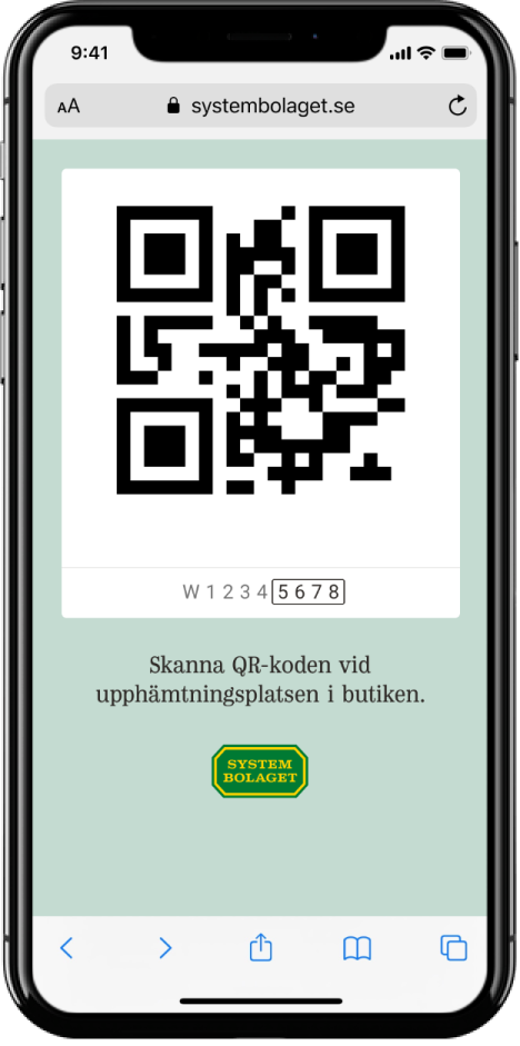
New QR Code
Previous vs new terminal waiting screen
‣ New waiting screen added two-step process. 'Hämtas nu' and 'på tur'. Letting customer easier estimate how long to wait for picking up order.
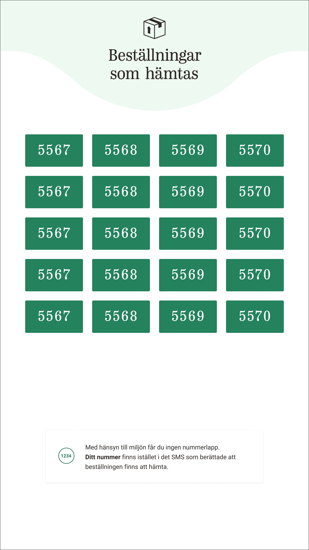
Old waiting screen
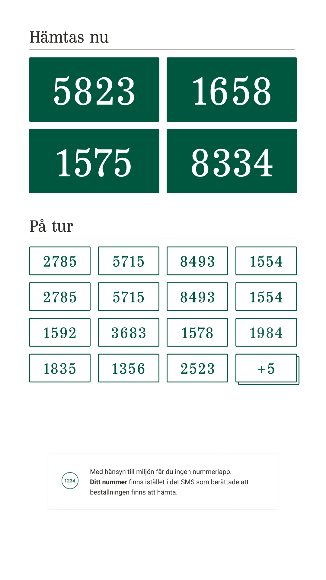
New waiting screen
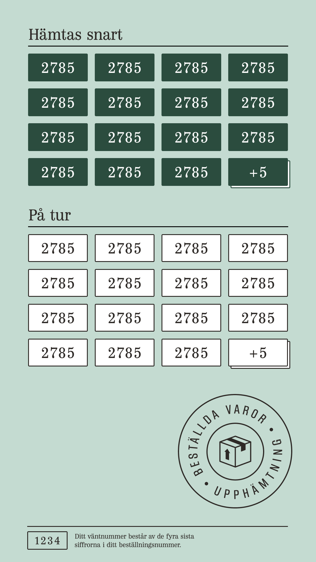
New waiting screen high-fidelity
Previous vs new terminal home screen after my reasearch
‣ Stripped design with less copy, colours, text formatting and instructions. Less confusing.
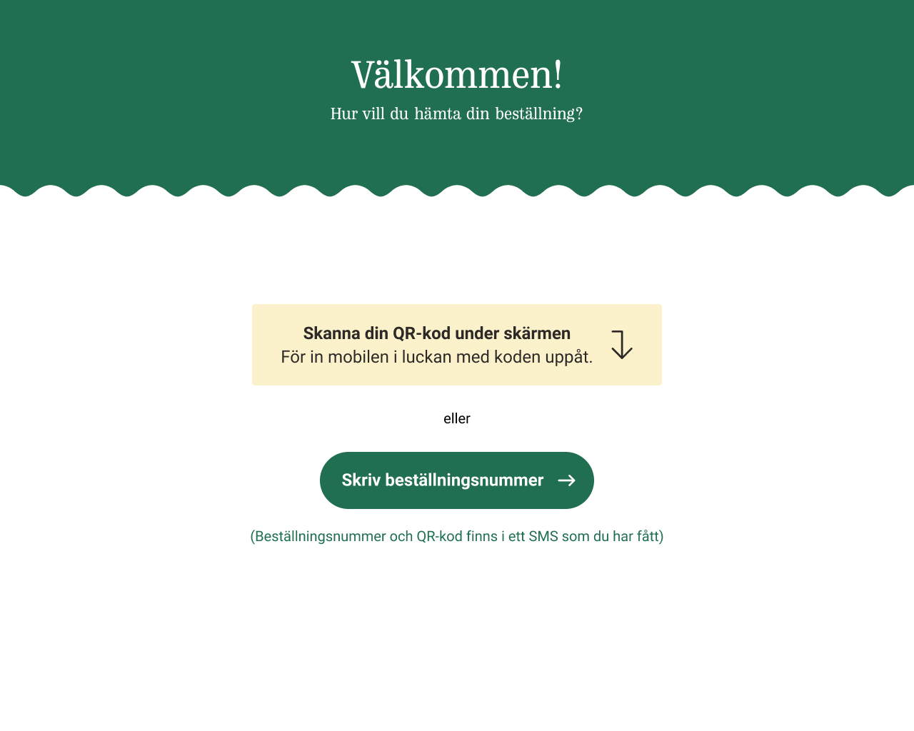
Old home screen

Wireframe home screen
Old home screen and new wireframe home screen
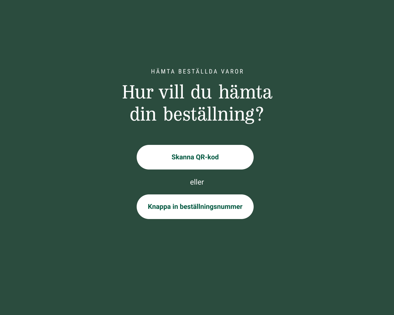
New home screen
New home screen
Previous userflow
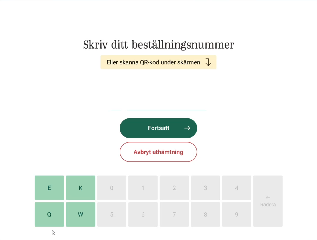
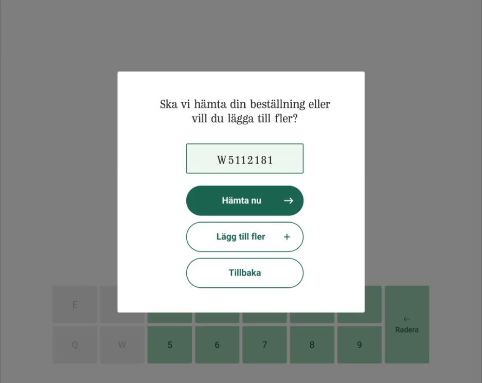
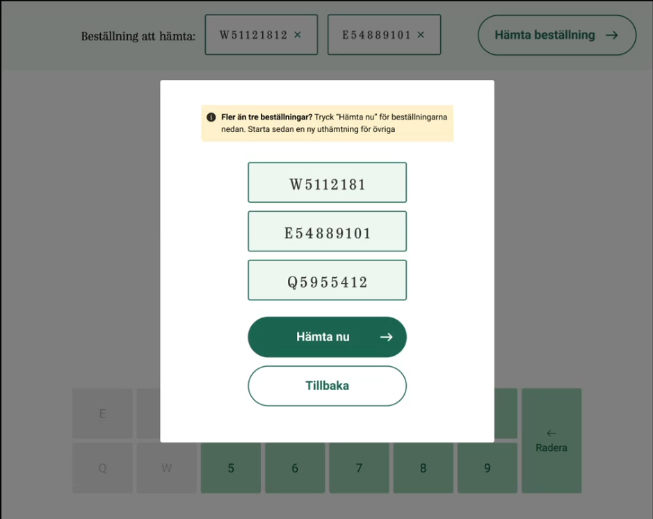
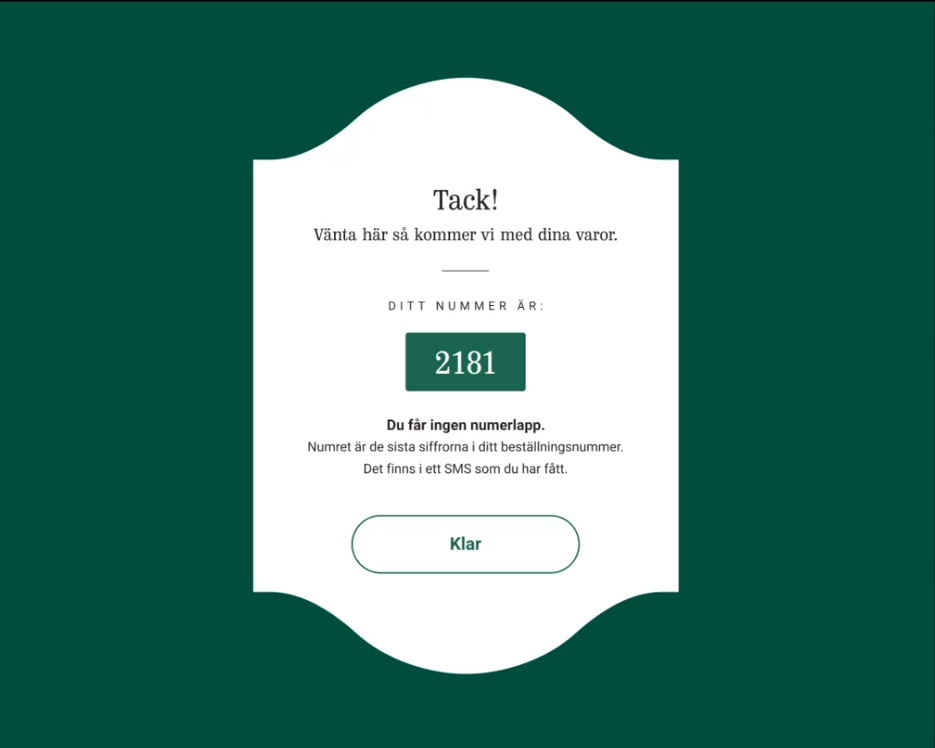
New userflow wireframes
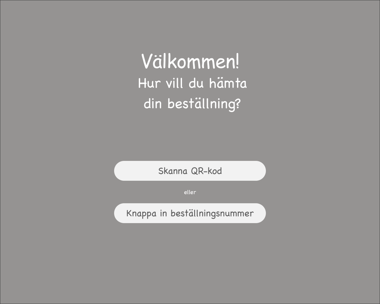
Home Screen
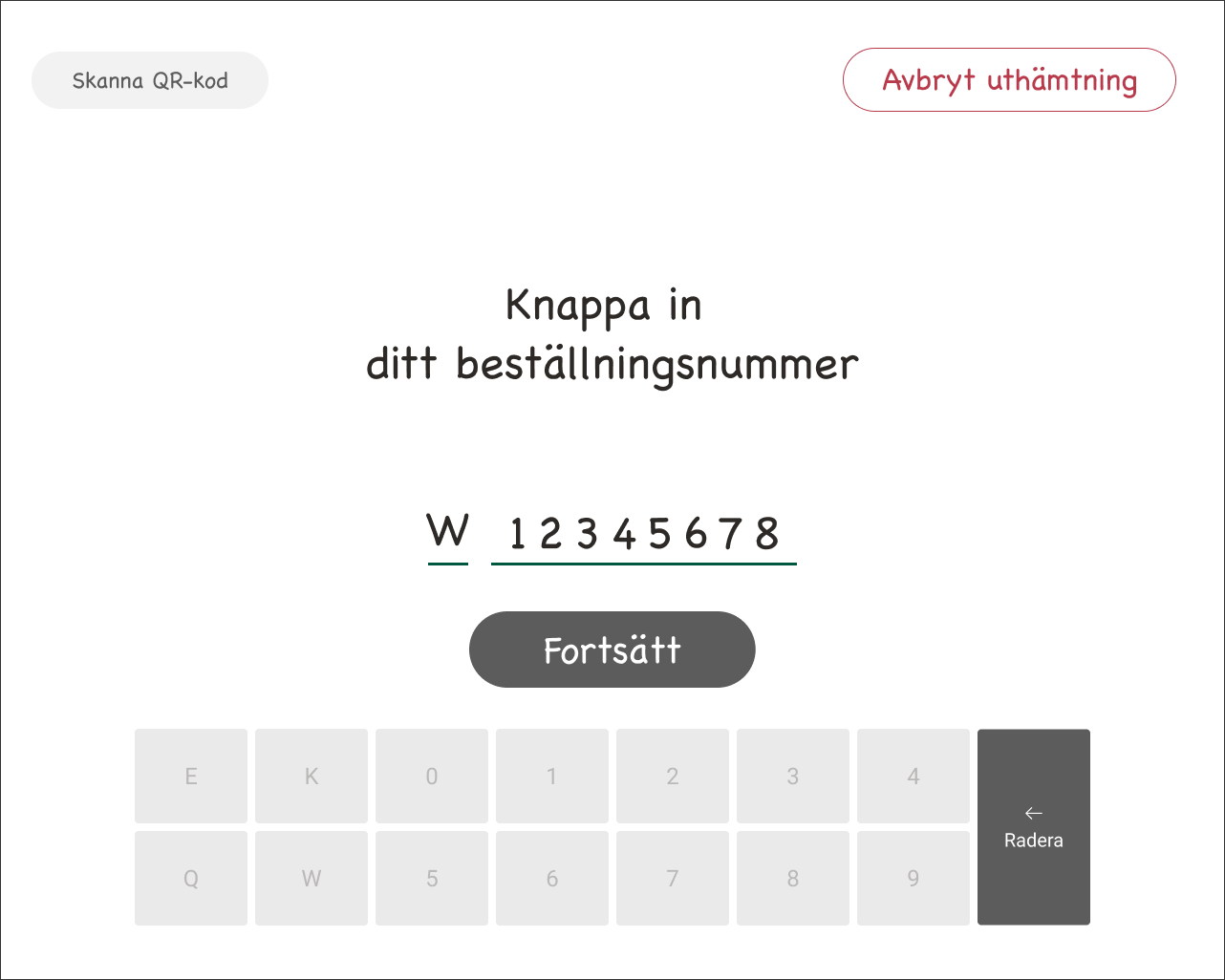
Add first order manually
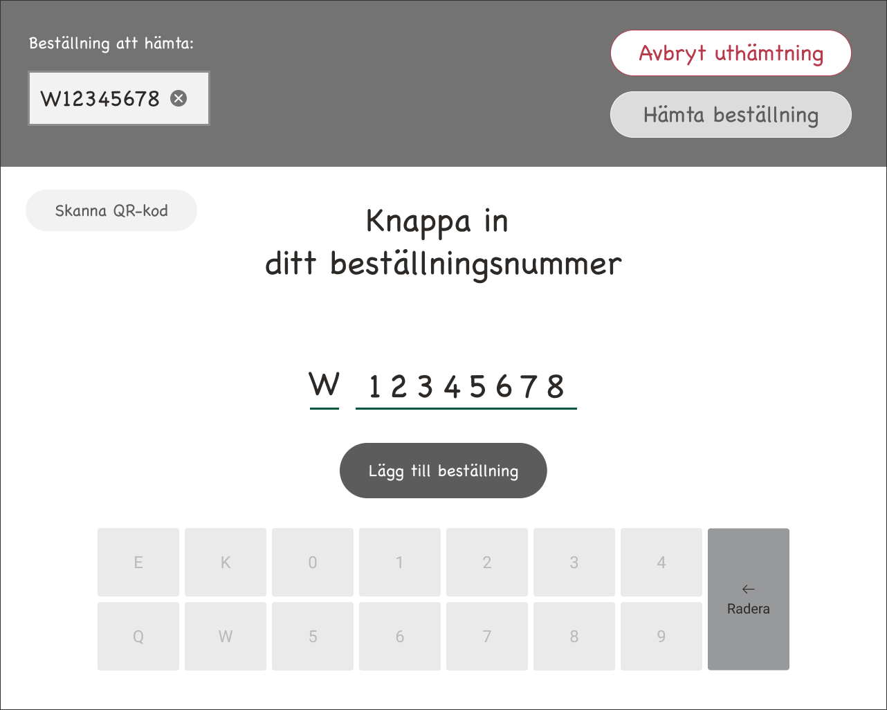
Add second order manually
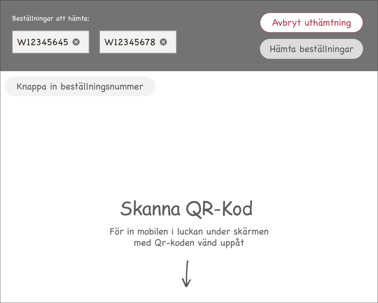
Add third order QR-Code
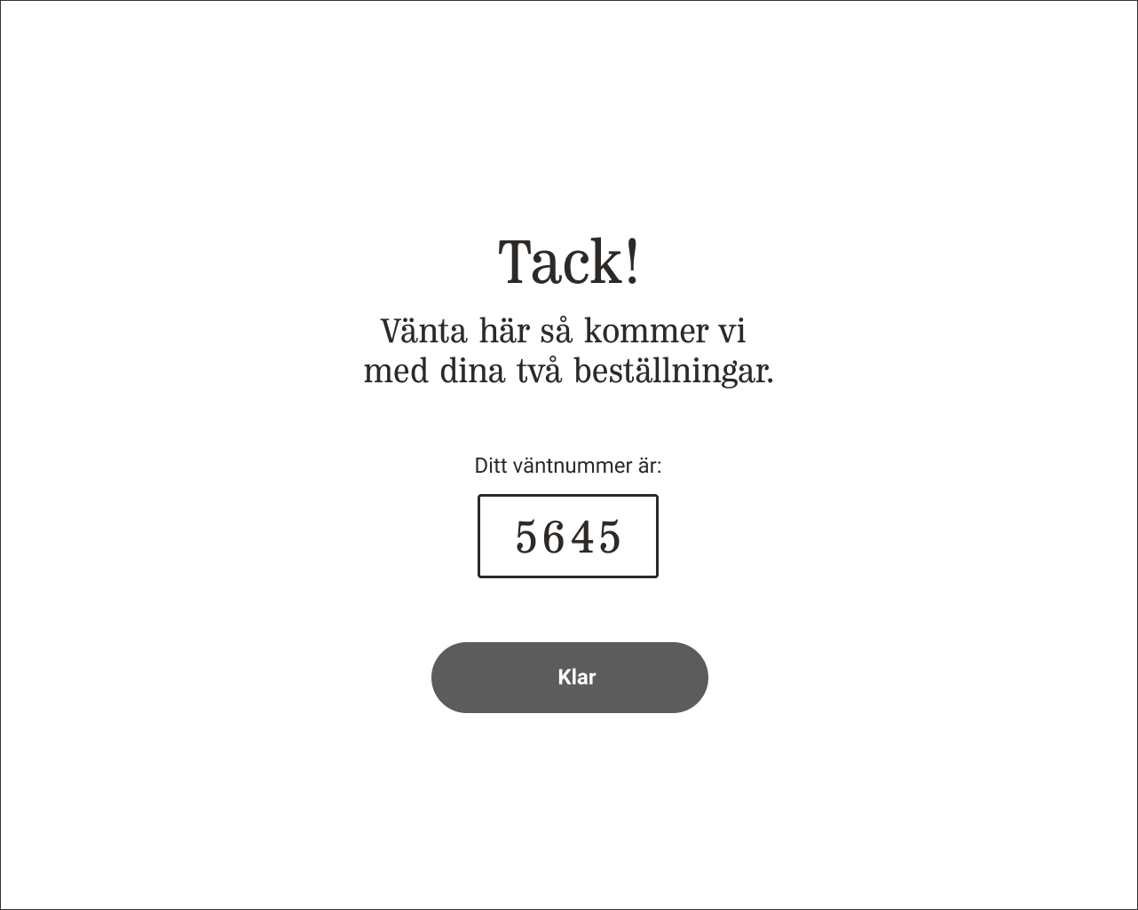
Final Screen
New userflow High-Fidelity mockups

Home screen
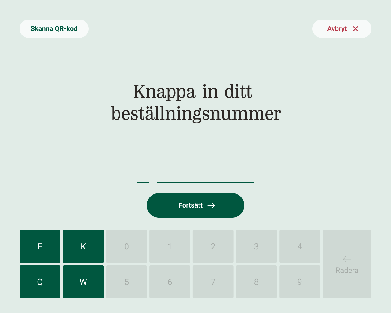
manually add first order
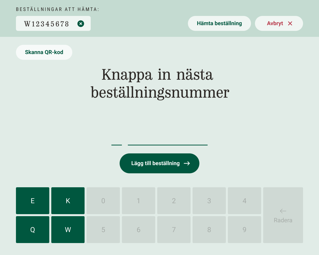
manually add second order
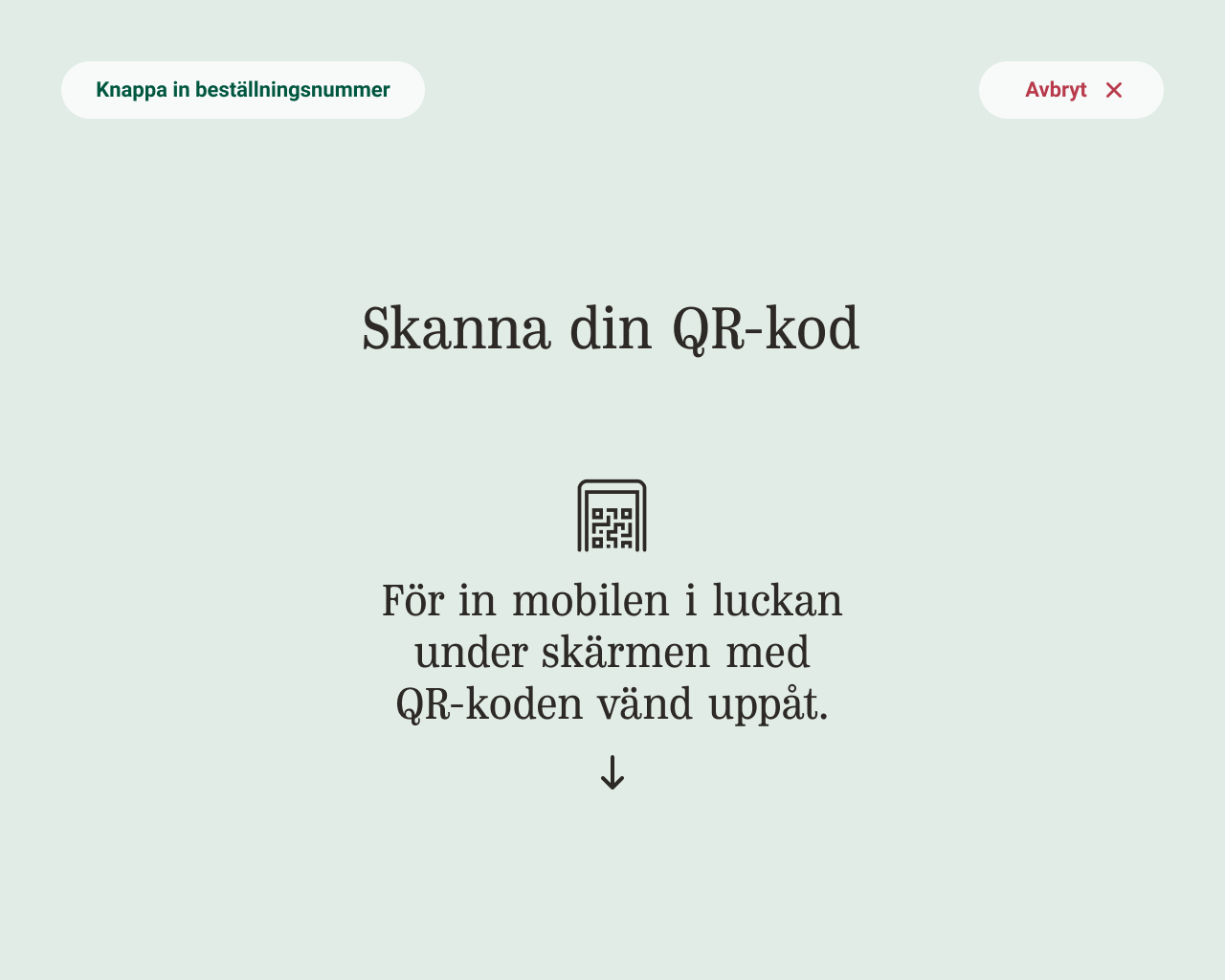
Add order with QR-Code
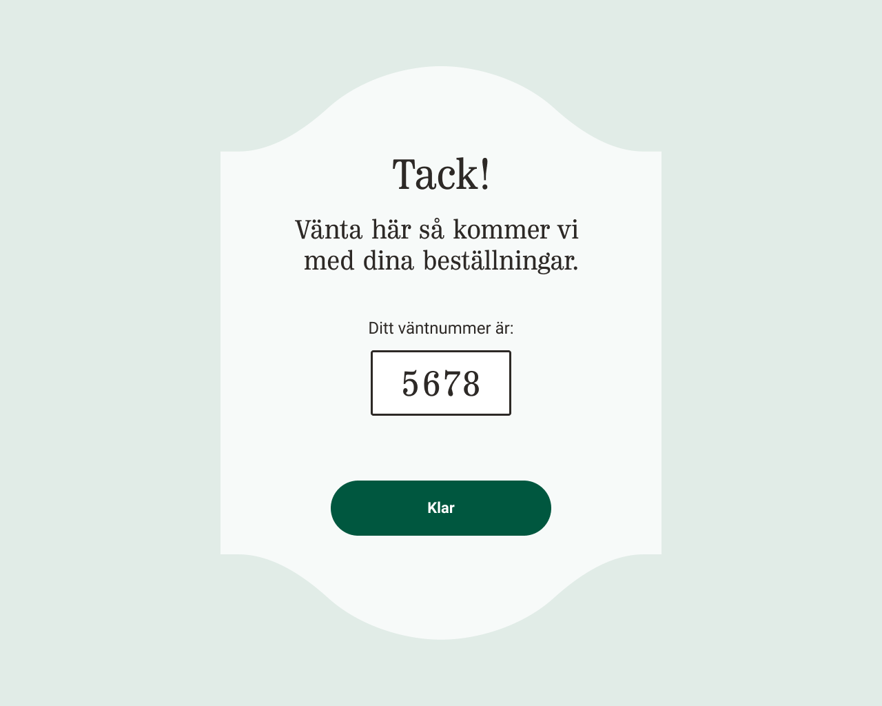
Final screen
The new tests and design solutions proved sky-high results.
If you are further interested in my work with the pick-up point:
rydholm.melker@gmail.com
rydholm.melker@gmail.com