01. Background
During my time at LF, I worked part-time on an innovative feature related to sustainability analysis for money funds. We observed that many of our competitors had already implemented ways for their customers to assess the sustainability of their investments. Additionally, there was a noticeable surge in market interest with people becoming more conscious of sustainability and sustainable savings.
Our primary objective was to empower our customers with the knowledge of how to save sustainably and inform them about their investment choices. For instance, we recognized that customers preferred not to invest in questioned industries like weapons manufacturing and tobacco.
Our stakeholders recommended starting with several well-established measurement values within their domain:
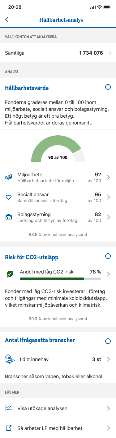
‣ ESG (Environmental, Social, and Governance) criteria
‣ Morningstar's sustainability score
‣ EU classification (Article 8 and 9)
‣ CO2 risk assessment
‣ Funds that actively avoid investments in fossil fuels
The project aimed to create a user-friendly analysis that would help customers make informed, sustainable investment decisions while aligning with the growing market demand for eco-conscious financial solutions.
02. My task
My responsibility was to translate these key measurement values into a user-centric and visually engaging design.
The design phase involved creating an interface that made these complex sustainability metrics not only comprehensible but also engaging for our users. To ensure the effectiveness of the design, I conducted usability tests, seeking insights into which aspects resonated most with our customers and encouraged them to delve deeper into sustainable investing.
Usability testing gave us valuable insights into design clarity and user-friendliness. It pinpointed user-friendly areas and opportunities for simpler language, closing the gap between company lingo and user-friendly content.
03. Insights
Throughout this project, I gained valuable insights into the user experience:
Easiest to Understand: Two aspects stood out as the easiest for users to grasp and appreciate:
‣ ESG (Environmental, Social, and Governance) criteria
‣ CO2 risk assessment
Challenging to Appreciate: Conversely, the following areas proved to be more complex and less appreciated:
‣ Morningstar's sustainability score
‣ EU classification (Article 8 and 9)
‣ Funds that actively avoid investments in fossil fuels
‣ CO2 risk assessment
Challenging to Appreciate: Conversely, the following areas proved to be more complex and less appreciated:
‣ Morningstar's sustainability score
‣ EU classification (Article 8 and 9)
‣ Funds that actively avoid investments in fossil fuels
Similar User Perception: Two elements garnered similar user perceptions:
‣ Funds that actively avoid investments in fossil fuels
‣ CO2 risk assessment
‣ CO2 risk assessment
Furthermore, we discovered that users have a genuine interest in understanding the sectors in which their investments are placed. To address this need, we introduced a "Questioned Industries" section, which we initially overlooked.
Lastly, we recognized that our initial drafts presented an overload of data. As a result, we shifted our approach toward a "less is more" design philosophy. Additionally, we introduced an "Advanced Analysis" feature for users seeking more in-depth insights into their investments. These findings ensured the design aligned with user preferences and needs.
04. UX Handover
If you are further interested in my work with the sustainability analysis:
rydholm.melker@gmail.com
rydholm.melker@gmail.com